- General
-
 Feature Requests

+1
UI Request: Streamline Tires Menuing
Hey Team!
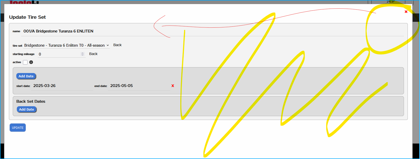
I've been doing more work in the Tires section, and I've noticed that some of the UI elements default to a very wide layout, perhaps unnecessarily.
Can this be reduced to fit the content? A picture of the current layout is attached, showing the collection of buttons and data on the left, and the exit element on the far right creating wasted space in between.
Customer support service by UserEcho
