- General
-
 Feature Requests

0
Completed
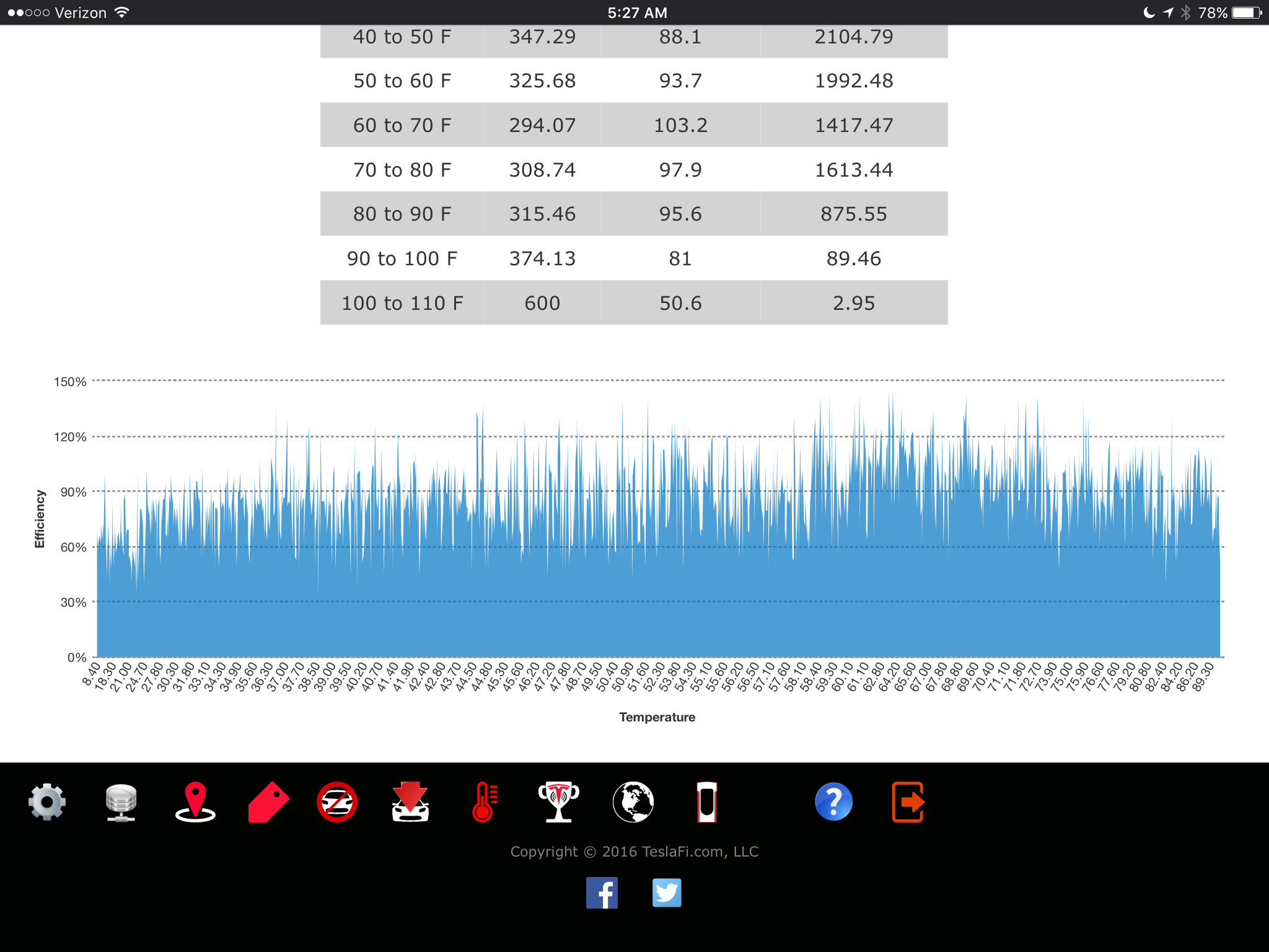
Temperature graph improvements.
Thanks for this. However, this graph is pretty difficult to read without some courser grouping of temperatures on the x-axis (I.e. rather than graphing efficiency by tenths or a degree, group into full degree -- or even five-degree -- increments). That way the graph would be much less "spikes" (see below) and more legible and useful:
Customer support service by UserEcho

Just curious to better understand this data... is it reflective of external temperature or internal battery temperature?
Cheers,
-Rafiq
External temperature
Could we please get a temperature range of 110-120? Phoenix has at least 30 days a year when the temp is over 110.
Hi,
I'm seeing the 110-120 on your temperature page. Is it not displaying for you or missing data?
Thanks,
James
I like it a lot. It's similar to a graph that I maintain using TeslaFi data, though I use Energy Consumption rather than efficiency (see below). Difference is that I graph all of the drive distances on the same graph.
I would contend, though (and I commented on this in a different thread), that an even more useful view is to look at the drive filters in INTERVALS (e.g. 1-5 miles, 5-10 miles, 10-25 miles, etc.) rather than minimums. That way, you can really see how efficiency varies by temperature and drive length. I would suggest defaulting to "ALL DRIVES" display, and offering filters by intervals.
Perfect. I'll close this one out and we'll leave http://support.teslafi.com/topics/20-filter-temperatureefficiency-stats-by-distance-ranges-rather-than-distance-minimums/ open.
Thanks
How does this look?
Agreed. I'll see what I can do to make it more legible. Thanks.